I chose five personal websites out of the thirty or so I visit regularly and tried to understand what it is about them that utterly captures me.
Whether or not it is obvious to you, I have stolen many things from the following websites. Be it design tweaks, post ideas, or even turns of phrase. These websites are incredible and you should consume them.
Good artists borrow, great artists steal use the inspect tool.
arcana.computer
I have been following Justin Duke's writing for close to two years. His older page is now depreciated and he posts to arcana dot computer, an open source website filled with catalogs and footnotes and light-touch design. The main framework is Jekyll, with dynamic content powered by Airtable. The About page of Justin's website explains the development/design/ideas behind the website in rich detail. So in this section I'll instead focus on how I feel about the website.
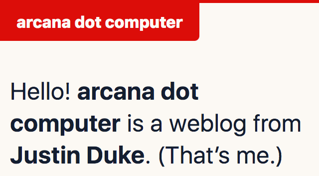
My philosophy towards personal websites matches Justin's. He writes:
Lastly, if there’s anything I can convince you of: you should build a personal site, you should obsess over it, you should meticulously document it, and you should have quite a bit of fun doing so. (It’s worth it.)
The content throughout these pages is personal and reads true. Although it's not a journal as such, as I read through the notes and reviews I get a secret feeling that I'm looking somewhere I shouldn't be — like peeking in a hidden diary.
Justin writes about capturing his media diet:
This started out as a lazy compulsion, but I’ve grown rather found of this habit over time. “You are what you eat”, and all that — I’ve realized that paying more attention to how I’m spending my consumptive time has made me more focused on consuming what I’m interested in, and not simply what’s easiest.
He talks about reviewing older sections of his media diet and how it helps him recollect that time in his life — "suddenly I am taken back to my old apartment on Capitol Hill, and my three weeks of funemployment before Stripe". When coming across old words that I have written, I've also experienced this almost-olfactory flashback of thoughts.
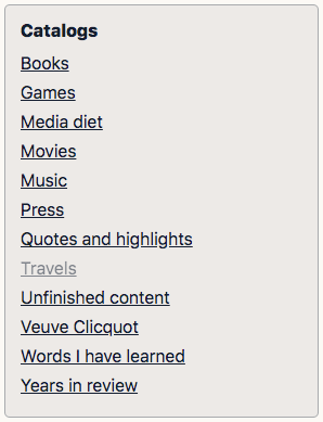
Overall, I am impressed with the breadth and depth of content on Justin's website, as well as how he's made Airtable work for him. I also like that sections are marked as in-progress. I like the personal structure to it. His methods for working on this website are similar to the goals of the Long Now and that gels with me.
paulstamatiou.com
Paul Stamatiou writes long form articles about his life and technology. If someone has a curiosity about a subject that he has covered (e.g. creating with the iPad Pro, or building a lightroom PC) I wouldn't hesitate linking one of his articles to them — perhaps without even reading it — because of the consistent high quality I have come to expect.

However, this quality comes with a cost, as he describes in Writing more:
I'm going to try something different and write more short-form posts here.
Over the years my focus has been increasing the quality of my articles. They've ended up becoming increasingly time-consuming to create.
Although these articles (which for now he seems to have dubbed "briefs") are shorter and less researched than his other writing they read as complete entries to me. On another website, by another person, they would be complete blog posts.
The more things I write, the more hesitant I am to actually publish. So the way he talks about blogging in Writing more resonates with me:
I want to get back to what blogging felt like when I started in 2005. Back when posting a few sentences and publishing it within the same computing session was so easy and fun. Where expectations were low and it didn't have to be perfect.
He has written 1210 posts since 2005. My first thought goes to the build times of such a website! In 2011, he migrated from Wordpress to Jekyll. This year he tweeted that he's looking at moving again:
really, really want to migrate my jekyll blog to Hugo + Netlify but I have so many weird jekyll hacks and collections and templates/includes that I'm sure the migration would take months of spare time.
probably faster to build a new site from the ground up, new CSS and all
Also this year, he was interviewed about his work (he's a designer at Twitter) and about his blog on Thunder Nerds. (More people should be interviewed about their technology blogs please.)
Paul is a photographer who generates fantastic photo sets and write ups with little animated maps of the location. His photos, and the way they are arranged, is truly fantastic. He has of course written thousands of words about his camera gear.
arp242.net
Martin Tournoij is the creator of Goat Counter and has posts dating back to 2013. His personal website is Jekyll-based and open source. I usually run into his writing on lobste.rs (a computing-focused community).
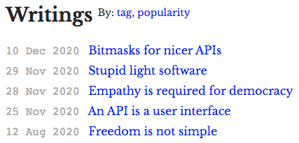
I like the one-page layout of the landing page. There's a list of posts and projects, a picture, and a link to his CV. My favorite post of his is Analytics on personal websites — where he argues in part for vanity statistics:
As for "vanity stats" or "stats to stroke your ego": I think that’s actually a valid use case as well. After you spent quite a bit of your spare time writing an article it’s just nice to know people are actually reading it. There’s nothing wrong with being validated – it’s a basic psychological need and I’m not a fan of casually dismissing it.
Later on, he wrestles with the fact that since he's the creator of an analytics tool, he doesn't want this website to turn into an advertising channel for it.
Martin doesn't shy away from controversial subjects on his blog. He writes about freedom and democracy, he pushes for empathy towards those he disagrees with. He writes without restraint which is admirable in itself.
He uses his own CSS template (arp242/hello-css) which is worth a look. If you'll allow me to use a vague statement, his website has a unique visual readability to it.
joelcalifa.com
Joel Califa's website has whimsy. It doesn't take itself seriously.

Clicking this button makes text spawn and fly away and fade (the snippets are things from the old web like: <i>, <frameset>, <marquee>, etc). There's an illustration of his head that hides away when you hover near. The writing in the section headers frizzles with energy.
Joel's website successfully serves as both a work portfolio and a design blog. His Work page describes itself as a "A sample of text-heavy case studies for patient visitors." The design blog has "Low frequency, high quality design articles."
My favorite post is Tiny Wins:
I recently shipped two things at GitHub that had an impact beyond my wildest dreams.
Where he discusses the work involved in designing dynamic favicons for the Pull Request page:
Now browser tabs will always show a PR’s current build status.
As well as adding an arrow that signals which branch your changes are "flowing" into:
Before releasing this, people would regularly confuse which branch would be merged into which.
He writes with authentic authority. He covers subjects that seem so obvious after you read them. Like in Revisiting :Visited, where research, the web specification, and its practical uses, are combined:
A Nielsen study summed this up nicely over ten years ago, “People get lost and move in circles when websites use the same link color for visited and new destinations. To reduce navigational confusion, select different colors for the two types of links.”
Can’t we, as an industry, get behind that reasoning? A “visited” link isn’t that far off from a “read” email. They both provide the user with the tacit understanding of where they’ve been.
Joel exists in the wonderful space between technology and design where he is addressing problems that directly relate to me. For example, his website is the first place I read a serious defense of the month/day/year date ordering system.
It fills me with joy that I have only read half of his content.
rsms.me
Rasmus Andersson has the prettiest website in this list. An elegant three-column layout that perfectly scales to the browser's width — dropping to two columns then one column. When a page is selected from the top right menu, the background changes to a rich color and shifts the menu up or down. With a wide enough browser, gray bars frame the website on either side.
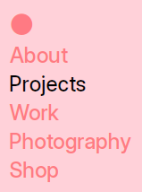
Rasmus is the creator of the Inter font and uses it to great effect with bold hover colors.
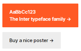
Even his 404 page is sharp.
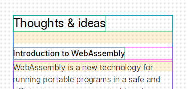
After looking around more, I found a <script> tag that includes main.js, a debug tool that must have been used to develop the grid layout (which I think is based on rsms/raster). Pressing alt+D or alt+G overlays a system of boxes and dots.
Rasmus's last post was in 2017 — Introduction to WebAssembly — but it's one that I revisit often as it's a clear and detailed explanation of the technology.
His use of the right arrow symbol (U+2192) as well as the rounded hover effect on titles (e.g. "Projects" and "Thoughts and ideas") is something that I closely copied for my own website as it is just too perfect.
Like Paul Stamatiou, Rasmus has hundreds of articles and has been blogging for a long time – almost two decades. The earlier posts are more likely to be reblogs, quotes, links, and small thoughts. The kind of things that Twitter is now used for.
Unlike Twitter, the permanence of these small thoughts is poetic. Here, in 2002, a new font is announced next to something like a diary entry without a paragraph break in between:
I’ve completed a new typeface. It’s a sweet little thing called Hovden Stitch. Yes your guess was correct. It looks like stitches, cross-stitches to be precise. Go get it for your mac or pc right here. Yesterday I hung out on a free festival here in Trollhättan. Laurel Music was great. Paola sucked. Laurel Music is playing at the next Club Feber in Trollhättan.
Hovden Stitch is alive today at rsms/hovden-stitch.
A decade and one month ago, a cosy post called The snow is gently falling has a polaroid of a 15" MacBook, a notebook, a warm drink, and the snow outside. A single sentence reads:
Building some software while the snow is gently falling down over a quiet Stockholm.
On Reading Writing
You cannot meet someone through their writing. There is always something held back, something distorted. But still, I try. As I spend more time on the internet in these COVID-times, I find myself running into a problem that plagued me during my undergrad years: is it possible to truly connect with someone through language?
One cynical view of language is that it's referential. David Foster Wallace writes about this view:
In order for language both to be meaningful and to have some connection to reality, words like “tree” and “house” have to be like little pictures, representations of little trees and houses. Mimesis. But nothing more. Which means we can know and speak of nothing more than little mimetic pictures. Which divides us, metaphysically and forever, from the external world.
Thinking about this stuff puts me in a real funk and I begin to think about reading and speaking like it's a battle. Like I am trapped inside with my secret language and you are trapped inside with yours. The glyphs arrive in my browser and I read and scroll and read and I'm trying to meet you somewhere between my head and yours — to not be alone.